Originally published in September 2024. The screens below show Canva’s product at that time. We revised this article in September 2026 to remove outdated valuation, pricing, and trial claims; Canva’s current experience may differ.
A paywall works best when it helps someone finish the thing they came to do. Canva’s 2024 upgrade screens offered a useful example: premium features were visible during creation, and the upgrade appeared in the context of the feature a user had chosen.
A small premium cue does a big job
Canva used a crown next to premium features. The marker distinguished free and paid capabilities without hiding the paid options until a user reached a pricing page. A person browsing tools could understand that an upgrade was available before clicking into it.
The lesson is to make the boundary legible. A label, icon, or short line of copy should tell the customer which capability requires payment. It should not make the basic task harder to complete.
Show the relevant feature, then the offer
When a user tried a premium feature, the upgrade screen related to that feature. The 2024 examples showed Canva Pro alongside a preview of the capability, rather than starting with an exhaustive plan matrix. That made the value proposition more concrete: the customer could see what they would gain for the task at hand.
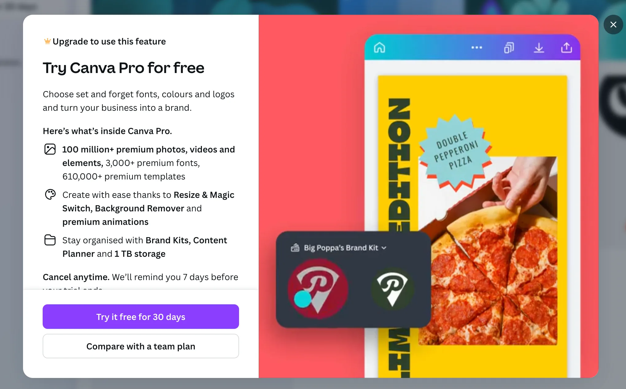
The same pattern applies to a product with several paid capabilities. An upgrade prompted by a brand tool should explain the brand tool first. A broader comparison can remain available for customers who need to compare plans.
Let people evaluate before they pay
The original screenshots showed the paid capability in the context of the current workspace. That is more useful than an abstract list of benefits. A preview can answer practical questions: what will this change, where will it appear, and can I continue my work afterward?
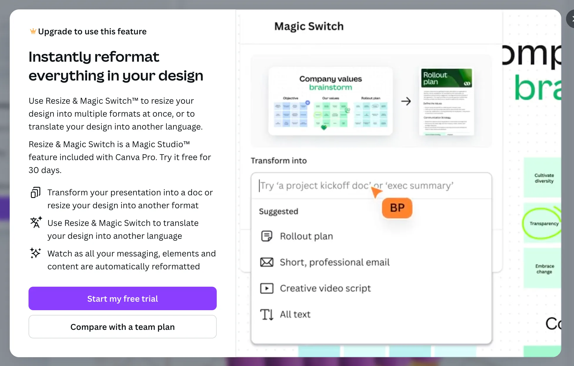
Avoid claiming a preview will raise conversion on its own. Its value is that it helps customers make an informed decision while they still remember why they opened the offer.
Keep the handoff clear
The screens kept the upgrade close to the product experience. That preserved the user’s context and made it easier to resume the design task. If payment must happen on another page, explain the transition, keep track of the original task, and return the customer to it after payment.
The offer should also state the actual price, billing interval, trial terms, and what happens when a trial ends. Those details change over time, so this historical teardown does not reproduce Canva’s 2024 prices as current advice.
What to apply to your own paywall
- Mark paid capabilities consistently where customers encounter them.
- Connect the upgrade message to the feature that prompted it.
- Show the outcome in the customer’s current workflow.
- Make payment and trial terms explicit before checkout.
- Preserve the task and return path through the purchase.
These are product design choices, not a claim about Canva’s conversion rate. For a current implementation path, explore Plandalf Checkouts and Offers documentation.